
COVID-19 in Belgium

Introduction
The Novel COVID-19 Coronavirus is still spreading quickly in several countries and it does not seem like it is going to stop anytime soon as the peak has not yet been reached in many countries.
Since the beginning of its expansion, a large number of scientists across the world have been analyzing this Coronavirus from different perspectives and with different technologies with the hope of coming up with a cure in order to stop its expansion and limit its impact on citizens.
Motivations, limitations and structure of the article
By seeing and organizing many R resources about COVID-19, I am fortunate enough to have read a lot of excellent analyses on the disease outbreak, the impact of different health measures, forecasts of the number of cases, projections about the length of the pandemic, hospitals capacity, etc.
Furthermore, I must admit that some countries such as China, South Korea, Italy, Spain, UK and Germany received a lot of attention as shown by the number of analyses done on these countries. However, to my knowledge and at the date of publication of this article, I am not aware of any analysis of the spread of the Coronavirus specifically for Belgium.1 The present article aims at filling that gap.
Throughout my PhD thesis in statistics, my main research interest is about survival analysis applied to cancer patients (more information in the research section of my personal website). I am not an epidemiologist and I have no extensive knowledge in modelling disease outbreaks via epidemiological models.
I usually write articles only about things I consider myself familiar with, mainly statistics and its applications in R. At the time of writing this article, I was however curious where Belgium stands regarding the spread of this virus, I wanted to play with this kind of data in R (which is new to me) and see what comes out.
In order to satisfy my curiosity while not being an expert, in this article I am going to replicate analyses done by more knowledgeable people and apply them to my country, that is, Belgium. From all the analyses I have read so far, I decided to replicate the analyses done by Tim Churches and Prof. Dr. Holger K. von Jouanne-Diedrich. This article is based on a mix of their articles which can be found here and here. They both present a very informative analysis on how to model the outbreak of the Coronavirus and show how contagious it is. Their articles also allowed me to gain an understanding of the topic and in particular an understanding of the most common epidemiological model. I strongly advise interested readers to also read their more recent articles for more advanced analyses and for an even deeper understanding of the spread of the COVID-19 pandemic.
Other more complex analyses are possible and even preferable, but I leave this to experts in this field. Note also that the following analyses take into account only the data until the date of publication of this article, so the results should not be viewed, by default, as current findings.
In the remaining of the article, we first introduce the model which will be used to analyze the Coronavirus outbreak in Belgium. We also briefly discuss and show how to compute an important epidemiological measure, the reproduction number. We then use our model to analyze the outbreak of the disease in the case where there would be no public health intervention. We conclude the article by summarizing more advanced tools and techniques that could be used to further model COVID-19 in Belgium.
Analysis of Coronavirus in Belgium
A classic epidemiological model: the SIR model
Before diving into the real-life application, we first introduce the model that will be used.
There are many epidemiological models but we will use one of the most common one, the SIR model. The SIR model can be complexified to incorporate more specificities of the virus outbreak, but in this article we keep its simplest version. Tim Churches’ explanation of this model and how to fit it using R is so nice, I will reproduce it here with a few minor changes.
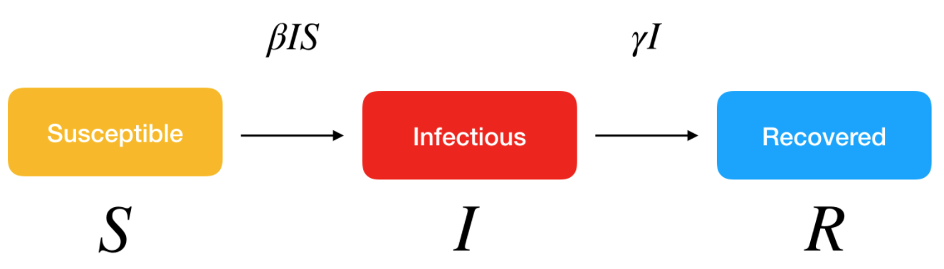
The basic idea behind the SIR model (Susceptible - Infectious - Recovered) of communicable disease outbreaks is that there are three groups (also called compartments) of individuals:
- S: those who are healthy but susceptible to the disease (i.e., at risk of being contaminated). At the start of the pandemic, S is the entire population since no one is immune to the virus.
- I: the infectious (and thus, infected) people
- R: individuals who were contaminated but who have either recovered or died. They are not infectious anymore.
These groups evolve over time as the virus progresses in the population:
- S decreases when individuals are contaminated and move to the infectious group I
- As people recover or die, they go from the infected group I to the recovered group R
To model the dynamics of the outbreak we need three differential equations to describe the rates of change in each group, parameterised by:
- \(\beta\), the infection rate, which controls the transition between S and I
- \(\gamma\), the removal or recovery rate, which controls the transition between I and R
Formally, this gives:
\[\frac{dS}{dt} = - \frac{\beta IS}{N} \text{ (Eq. 1)}\]
\[\frac{dI}{dt} = \frac{\beta IS}{N} - \gamma I \text{ (Eq. 2)}\]
\[\frac{dR}{dt} = \gamma I \text{ (Eq. 3)}\]
The first equation (Eq. 1) states that the number of susceptible individuals (S) decreases with the number of newly infected individuals, where new infected cases are the result of the infection rate (\(\beta\)) multiplied by the number of susceptible individuals (S) who had a contact with infectious individuals (I).
The second equation (Eq. 2) states that the number of infectious individuals (I) increases with the newly infected individuals (\(\beta I S\)), minus the previously infected people who recovered (i.e., \(\gamma I\) which is the removal rate \(\gamma\) multiplied by the infectious individuals I).
Finally, the last equation (Eq. 3) states that the recovered group (R) increases with the number of individuals who were infectious and who either recovered or died (\(\gamma I\)).
An epidemic develops as follows:
- Before the start of the disease outbreak, S equals the entire population as no one has anti-bodies.
- At the beginning of the outbreak, as soon as the first individual is infected, S decreases by 1 and I increases by 1 as well.
- This first infectious individual contaminates (before recovering or dying) other individuals who were susceptible.
- The dynamic continues, with recently contaminated individuals who in turn infect other susceptible people before they recover.
Visually, we have:
SIR model. Source: Kai Sasaki.
Before fitting the SIR model to the data, the first step is to express these differential equations as an R function, with respect to time t.
SIR <- function(time, state, parameters) {
  par <- as.list(c(state, parameters))
  with(par, {
    dS <- -beta * I * S / N
    dI <- beta * I * S / N - gamma * I
    dR <- gamma * I
    list(c(dS, dI, dR))
  })
}
Fitting a SIR model to the Belgium data
To fit the model to the data we need two things:
- a solver for these differential equations
- an optimiser to find the optimal values for our two unknown parameters, \(\beta\) and \(\gamma\)
The function ode() (for ordinary differential equations) from the {deSolve} R package makes solving the system of equations easy, and to find the optimal values for the parameters we wish to estimate, we can just use the optim() function built into base R.
Specifically, what we need to do is minimise the sum of the squared differences between \(I(t)\), which is the number of people in the infectious compartment \(I\) at time \(t\), and the corresponding number of cases as predicted by our model \(\hat{I}(t)\). This quantity is known as the residual sum of squares (RSS):
\[RSS(\beta, \gamma) = \sum_t \big(I(t) - \hat{I}(t) \big)^2\]
In order to fit a model to the incidence data for Belgium, we need a value N for the initial uninfected population. The population of Belgium in November 2019 was 11,515,793 people, according to Wikipedia. We will thus use N = 11515793 as the initial uninfected population.
Next, we need to create a vector with the daily cumulative incidence for Belgium, from February 4 (when our daily incidence data starts), through to March 30 (last available date at the time of publication of this article). We will then compare the predicted incidence from the SIR model fitted to these data with the actual incidence since February 4. We also need to initialise the values for N, S, I and R. Note that the daily cumulative incidence for Belgium is extracted from the {coronavirus} R package developed by Rami Krispin.
# devtools::install_github("RamiKrispin/coronavirus")
library(coronavirus)
data(coronavirus)

`%>%` <- magrittr::`%>%`

# extract the cumulative incidence
df <- coronavirus %>%
  dplyr::filter(country == "Belgium") %>%
  dplyr::group_by(date, type) %>%
  dplyr::summarise(total = sum(cases, na.rm = TRUE)) %>%
  tidyr::pivot_wider(
    names_from = type,
    values_from = total
  ) %>%
  dplyr::arrange(date) %>%
  dplyr::ungroup() %>%
  dplyr::mutate(active = confirmed - death - recovered) %>%
  dplyr::mutate(
    confirmed_cum = cumsum(confirmed),
    death_cum = cumsum(death),
    recovered_cum = cumsum(recovered),
    active_cum = cumsum(active)
  )

# put the daily cumulative incidence numbers for Belgium from
# Feb 4 to March 30 into a vector called Infected
library(lubridate)

sir_start_date <- "2020-02-04"
sir_end_date <- "2020-03-30"

Infected <- subset(df, date >= ymd(sir_start_date) & date <= ymd(sir_end_date))$active_cum

# Create an incrementing Day vector the same length as our
# cases vector
Day <- 1:(length(Infected))

# now specify initial values for N, S, I and R
N <- 11515793
init <- c(
  S = N - Infected[1],
  I = Infected[1],
  R = 0
)
Note that what is needed are currently infected persons (cumulative infected minus the removed, i.e. recovered or dead). However, numbers of recovered persons are hard to obtain and probably underestimated due to underreporting bias. I thus consider the cumulative number of infected people, which is probably not an issue here since the number of recovered cases is negligible at the time of the analysis.
Then we need to define a function to calculate the RSS, given a set of values for \(\beta\) and \(\gamma\).
# define a function to calculate the residual sum of squares
# (RSS), passing in parameters beta and gamma that are to be
# optimised for the best fit to the incidence data
RSS <- function(parameters) {
  names(parameters) <- c("beta", "gamma")
  out <- ode(y = init, times = Day, func = SIR, parms = parameters)
  fit <- out[, 3]
  sum((Infected - fit)^2)
}
Finally, we can fit the SIR model to our data by finding the values for \(\beta\) and \(\gamma\) that minimise the residual sum of squares between the observed cumulative incidence (observed in Belgium) and the predicted cumulative incidence (predicted by our model). We also need to check that our model has converged, as indicated by the message shown below:
# now find the values of beta and gamma that give the
# smallest RSS, which represents the best fit to the data.
# Start with values of 0.5 for each, and constrain them to
# the interval 0 to 1.0

# install.packages("deSolve")
library(deSolve)

Opt <- optim(c(0.5, 0.5),
  RSS,
  method = "L-BFGS-B",
  lower = c(0, 0),
  upper = c(1, 1)
)

# check for convergence
Opt$message
## [1] "CONVERGENCE: REL_REDUCTION_OF_F <= FACTR*EPSMCH"Convergence is confirmed. Note that you may find different estimates for different choices of initial values or constraints. This proves that the fitting process is not stable. Here is a potential solution for a better fitting process.
Now we can examine the fitted values for \(\beta\) and \(\gamma\):
Opt_par <- setNames(Opt$par, c("beta", "gamma"))
Opt_par
## beta gamma
## 0.5841185 0.4158816Remember that \(\beta\) controls the transition between S and I (i.e., susceptible and infectious) and \(\gamma\) controls the transition between I and R (i.e., infectious and recovered). However, those values do not mean a lot but we use them to get the fitted numbers of people in each compartment of our SIR model for the dates up to March 30 that were used to fit the model, and compare those fitted values with the observed (real) data.
# time in days for predictions
t <- 1:as.integer(ymd(sir_end_date) + 1 - ymd(sir_start_date))

# get the fitted values from our SIR model
fitted_cumulative_incidence <- data.frame(ode(
  y = init, times = t,
  func = SIR, parms = Opt_par
))

# add a Date column and the observed incidence data
library(dplyr)
fitted_cumulative_incidence <- fitted_cumulative_incidence %>%
  mutate(
    Date = ymd(sir_start_date) + days(t - 1),
    Country = "Belgium",
    cumulative_incident_cases = Infected
  )

# plot the data
library(ggplot2)
fitted_cumulative_incidence %>%
  ggplot(aes(x = Date)) +
  geom_line(aes(y = I), colour = "red") +
  geom_point(aes(y = cumulative_incident_cases), colour = "blue") +
  labs(
    y = "Cumulative incidence",
    title = "COVID-19 fitted vs observed cumulative incidence, Belgium",
    subtitle = "(Red = fitted from SIR model, blue = observed)"
  ) +
  theme_minimal()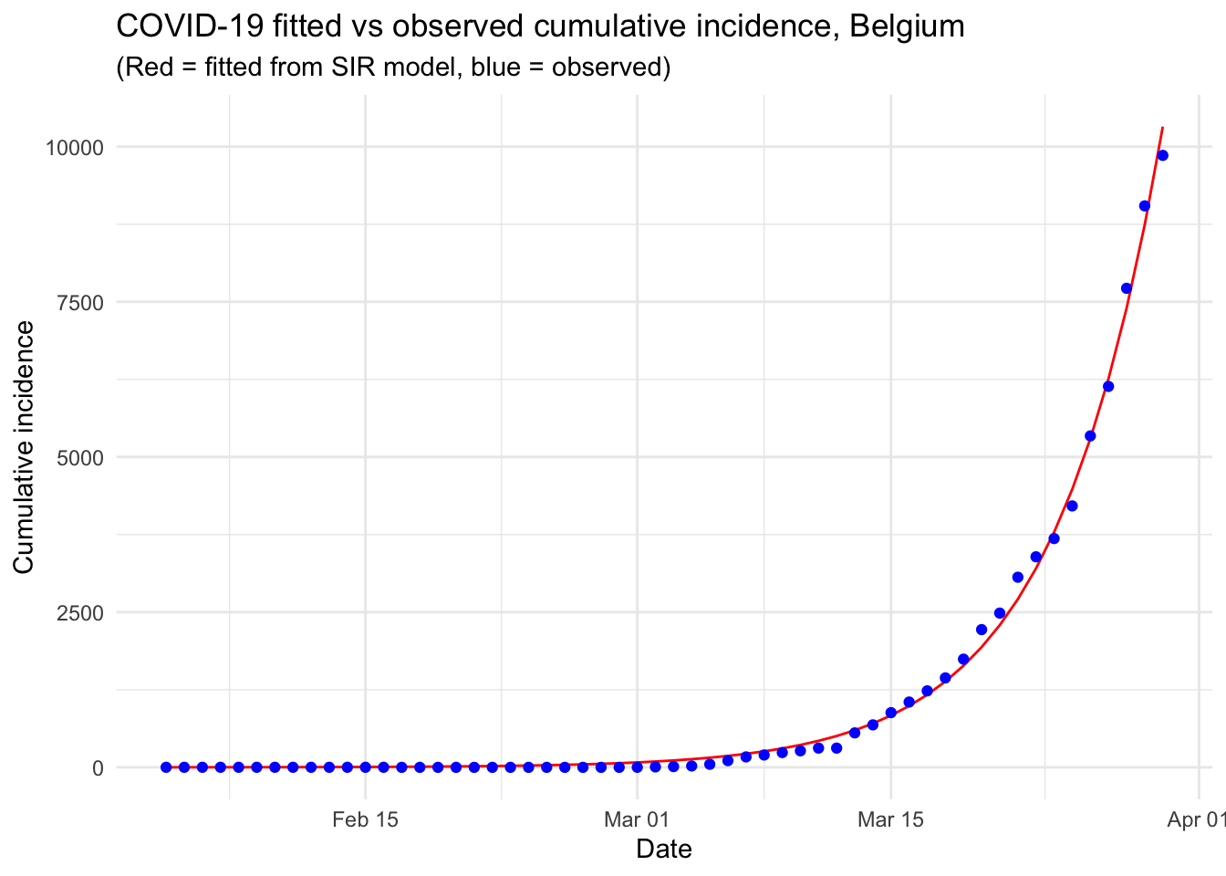
From the above graph we see that the number of observed confirmed cases follows (unfortunately) the number of confirmed cases expected by our model. The fact that both trends are overlapping indicates that the pandemic is clearly in an exponential phase in Belgium. More data would be needed to see whether this trend is confirmed in the long term.
The following graph is similar than the previous one, except that the y-axis is measured on a log scale. This kind of plot is called a semi-log plot or more precisely a log-linear plot because only the y-axis is transformed with a logarithm scale. Transforming the scale in log has the advantage that it is more easily readable in terms of difference between the observed and expected number of confirmed cases and it also shows how the number of observed confirmed cases differs from an exponential trend.
fitted_cumulative_incidence %>%
  ggplot(aes(x = Date)) +
  geom_line(aes(y = I), colour = "red") +
  geom_point(aes(y = cumulative_incident_cases), colour = "blue") +
  labs(
    y = "Cumulative incidence",
    title = "COVID-19 fitted vs observed cumulative incidence, Belgium",
    subtitle = "(Red = fitted from SIR model, blue = observed)"
  ) +
  theme_minimal() +
  scale_y_log10(labels = scales::comma)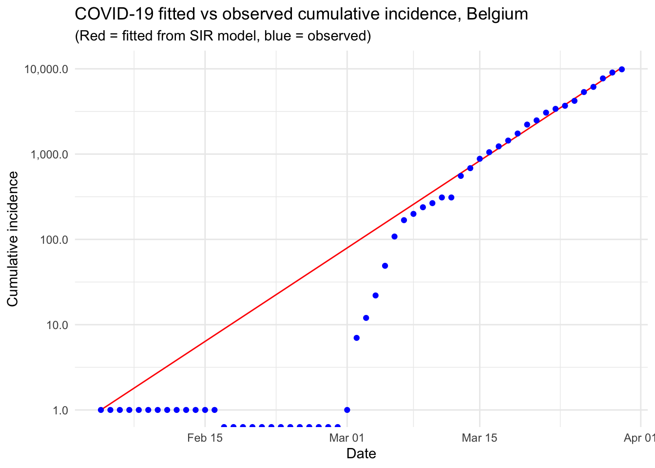
The plot indicates that, at the beginning of the pandemic and until March 12, the number of confirmed cases stayed below what would be expected in an exponential phase. In particular, the number of confirmed cases stayed constant at 1 case from February 4 to February 29. From March 13 and until March 30, the number of confirmed cases kept increasing at a rate close to an exponential rate.
We also notice a small jump between March 12 and March 13, which may potentially indicate an error in the data collection, or a change in the testing/screening methods.
Reproduction number \(R_0\)
Our SIR model looks like a good fit to the observed cumulative incidence data in Belgium, so we can now use our fitted model to calculate the basic reproduction number \(R_0\), also referred as basic reproduction ratio, and which is closely linked to \(\beta\) and \(\gamma\).2
The basic reproduction number \(R_0\) gives the average number of susceptible people who are infected by each infectious person where all individuals are susceptible to infection. In other words, the reproduction number refers to the number of healthy people that get infected per number of sick people. When \(R_0 > 1\) the disease starts spreading in a population, but not if \(R_0 < 1\). Usually, the larger the value of \(R_0\), the harder it is to control the epidemic and the higher the probability of a pandemic.
Formally, we have:
\[R_0 = \frac{\beta}{\gamma}\]
We can compute it in R:
Opt_par## beta gamma
## 0.5841185 0.4158816R0 <- as.numeric(Opt_par[1] / Opt_par[2])
R0## [1] 1.404531An \(R_0\) of 1.4 is below values found by others for COVID-19 and the \(R_0\) for SARS and MERS, which are similar diseases also caused by coronavirus. Furthermore, in the literature, it has been estimated that the reproduction number for COVID-19 is approximately 2.7 (with \(\beta\) close to 0.54 and \(\gamma\) close to 0.2). Our reproduction number being lower is mainly due to the fact that the number of confirmed cases stayed constant and equal to 1 at the beginning of the pandemic.
A \(R_0\) of 1.4 means that, on average in Belgium, 1.4 persons are infected for each infected person.
For simple models, the proportion of the population that needs to be effectively immunized to prevent sustained spread of the disease, known as the “herd immunity threshold”, has to be larger than \(1 - \frac{1}{R_0}\) (Fine, Eames, and Heymann 2011).
The reproduction number of 1.4 we just calculated suggests that, given the formula 1 - (1 / 1.4), 28.8% of the population should be immunized to stop the spread of the infection. With a population in Belgium of approximately 11.5 million, this translates into roughly 3.3 million people.
Using our model to analyze the outbreak if there was no intervention
It is instructive to use our model fitted to the first 56 days of available data on confirmed cases in Belgium, to see what would happen if the outbreak were left to run its course, without public health intervention.
# time in days for predictions
t <- 1:120

# get the fitted values from our SIR model
fitted_cumulative_incidence <- data.frame(ode(
  y = init, times = t,
  func = SIR, parms = Opt_par
))

# add a Date column and join the observed incidence data
fitted_cumulative_incidence <- fitted_cumulative_incidence %>%
  mutate(
    Date = ymd(sir_start_date) + days(t - 1),
    Country = "Belgium",
    cumulative_incident_cases = c(Infected, rep(NA, length(t) - length(Infected)))
  )

# plot the data
fitted_cumulative_incidence %>%
  ggplot(aes(x = Date)) +
  geom_line(aes(y = I), colour = "red") +
  geom_line(aes(y = S), colour = "black") +
  geom_line(aes(y = R), colour = "green") +
  geom_point(aes(y = cumulative_incident_cases),
    colour = "blue"
  ) +
  scale_y_continuous(labels = scales::comma) +
  labs(y = "Persons", title = "COVID-19 fitted vs observed cumulative incidence, Belgium") +
  scale_colour_manual(name = "", values = c(
    red = "red", black = "black",
    green = "green", blue = "blue"
  ), labels = c(
    "Susceptible",
    "Recovered", "Observed", "Infectious"
  )) +
  theme_minimal()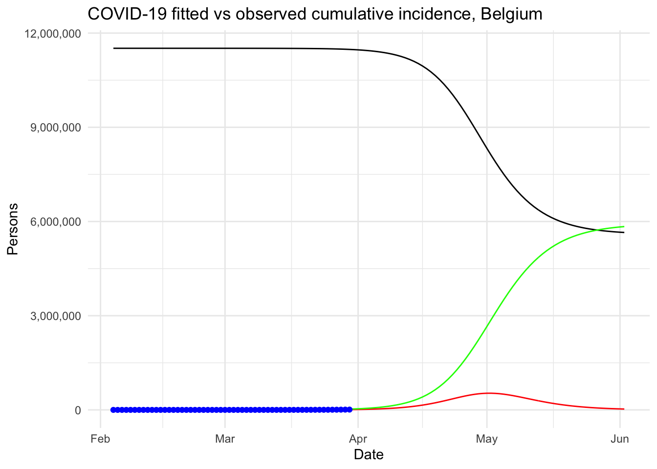
The same graph in log scale for the y-axis and with a legend for better readability:
# plot the data
fitted_cumulative_incidence %>%
  ggplot(aes(x = Date)) +
  geom_line(aes(y = I, colour = "red")) +
  geom_line(aes(y = S, colour = "black")) +
  geom_line(aes(y = R, colour = "green")) +
  geom_point(aes(y = cumulative_incident_cases, colour = "blue")) +
  scale_y_log10(labels = scales::comma) +
  labs(
    y = "Persons",
    title = "COVID-19 fitted vs observed cumulative incidence, Belgium"
  ) +
  scale_colour_manual(
    name = "",
    values = c(red = "red", black = "black", green = "green", blue = "blue"),
    labels = c("Susceptible", "Observed", "Recovered", "Infectious")
  ) +
  theme_minimal()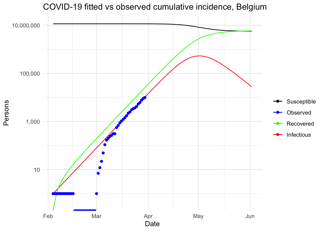
More summary statistics
Other interesting statistics can be computed from the fit of our model. For example:
- the peak of the pandemic
- the number of severe cases
- the number of people in need of intensive care
- the number of deaths
fit <- fitted_cumulative_incidence

# peak of pandemic
fit[fit$I == max(fit$I), c("Date", "I")]
## Date I
## 89 2020-05-02 531000.4# severe cases
max_infected <- max(fit$I)
max_infected * 0.2## [1] 106200.1# cases with need for intensive care
max_infected * 0.06## [1] 31860.03# deaths with supposed 4.5% fatality rate
max_infected * 0.045## [1] 23895.02Given these predictions, with the exact same settings and no intervention at all to limit the spread of the pandemic, the peak in Belgium is expected to be reached by the beginning of May. About 530,000 people would be infected by then, which translates to about 106,000 severe cases, about 32,000 persons in need of intensive care (given that there are about 2000 intensive care units in Belgium, the health sector would be completely overwhelmed) and up to 24,000 deaths (assuming a 4.5% fatality rate, as suggested by this source).
At this point, we understand why such strict containment measures and regulations are taken in Belgium!
Note that those predictions should be taken with a lot of caution. On the one hand, as mentioned above, they are based on rather unrealistic assumptions (for example, no public health interventions, fixed reproduction number \(R_0\), etc.). More advanced projections are possible with the {projections} package, among others (see this section for more information on this matter). On the other hand, we still have to be careful and strictly follow public health interventions because previous pandemics such as the Spanish and swine flu have shown that incredibly high numbers are not impossible!
The purpose of this article was to give an illustration of how such analyses are done in R with a simple epidemiological model. Those are the numbers our simple model produces and we hope they are wrong because the cost in terms of lives would be enormous.
Additional considerations
As previously mentioned, the SIR model and the analyses done above are rather simplistic and may not give a true representation of the reality. In the following sections, we highlight five improvements that could be done to enhance theses analyses and lead to a better overview of the spread of the Coronavirus in Belgium.
Ascertainment rates
In the previous analyses and graphs, it is assumed that the number of confirmed cases represent all the cases that are infectious. This is far from reality as only a proportion of all cases are screened, detected and counted in the official figures. This proportion is known as the ascertainment rate.
The ascertainment rate is likely to vary during the course of an outbreak, in particular if testing and screening efforts are increased, or if detections methods are changed. Such changing ascertainment rates can be easily incorporated into the model by using a weighting function for the incidence cases.
In his first article, Tim Churches demonstrates that a fixed ascertainment rates of 20% makes little difference to the modelled outbreak with no intervention, except that it all happens a bit more quickly.
More sophisticated models
More sophisticated models could also be used to better reflect real-life transmission processes. For instance, another classical model in disease outbreak is the SEIR model. This extended model is similar to the SIR model, where S stands for Susceptible and R stands for Recovered, but the infected people are divided into two compartments:
- E for the Exposed/infected but asymptomatic
- I for the Infected and symptomatic
These models belong to the continuous-time dynamic models that assume fixed transition rates. There are other stochastic models that allow for varying transition rates depending on attributes of individuals, social networking, etc.
Modelling the epidemic trajectory using log-linear models
As noted above, the initial exponential phase of an outbreak, when shown in a log-linear plot (the y-axis on a log scale and the x-axis without transformation), appears (somewhat) linear. This suggests that we can model epidemic growth, and decay, using a simple log-linear model of the form:
\[log(y)=rt+b\]
where y is the incidence, r is the growth rate, t is the number of days since a specific point in time (typically the start of the outbreak), and b is the intercept. In this context, two log-linear models:
- one to the growth phase (before the peak), and
- one to the decay phase (after the peak)
are fitted to the epidemic (incidence cases) curve.
The doubling and halving time estimates which you very often hear in the news can be estimated from these log-linear models. Furthermore, these log-linear models can also be used on the epidemic trajectory to estimate the reproduction number \(R_0\) in the growth and decay phases of the epidemic.
The {incidence} package in R, part of the R Epidemics Consortium (RECON) suite of packages for epidemic modelling and control, makes the fitting of this kind of models very convenient.
Estimating changes in the effective reproduction number \(R_e\)
In our model, we set a reproduction number \(R_0\) and kept it constant. It would nonetheless be useful to estimate the current effective reproduction number \(R_e\) on a day-by-day basis so as to track the effectiveness of public health interventions, and possibly predict when an incidence curve will start to decrease.
The {EpiEstim} package in R can be used to estimate \(R_e\) and allow to take into consideration human travel from other geographical regions in addition to local transmission (Cori et al. 2013; Thompson et al. 2019).
More sophisticated projections
In addition to naïve predictions based on a simple SIR model, more advanced and complex projections are also possible, notably, with the {projections} package. This packages uses data on daily incidence, the serial interval and the reproduction number to simulate plausible epidemic trajectories and project future incidence.
Conclusion
This article started with (i) a description of a couple of R resources on the Coronavirus pandemic (i.e., a collection and a dashboard) that can be used as background materials and (ii) the motivations behind this article. We then detailed the most common epidemiological model, i.e. the SIR model, before actually applying it on Belgium incidence data.
This resulted in a visual comparison of the fitted and observed cumulative incidence in Belgium. It showed that the COVID-19 pandemic is clearly in an exponential phase in Belgium in terms of number of confirmed cases.
We then explained what is the reproduction number and how to compute it in R. Finally, our model was used to analyze the outbreak of the Coronavirus if there was no public health intervention at all.
Under this (probably too) simplistic scenario, the peak of the COVID-19 in Belgium is expected to be reached by the beginning of May, 2020, with around 530,000 infected people and about 24,000 deaths. These very alarmist naïve predictions highlight the importance of restrictive public health actions taken by governments, and the urgency for citizens to follow these health actions in order to mitigate the spread of the virus in Belgium (or at least slow it enough to allow health care systems to cope with it).
We concluded this article by describing five improvements that could be implemented to further analyze the disease outbreak.
Note that this article has been subject to a talk at UCLouvain.
Thanks for reading. I hope this article gave you a good understanding of the spread of the COVID-19 Coronavirus in Belgium. Feel free to use this article as a starting point for analyzing the outbreak of this disease in your own country.
For the interested readers, see also:
- the evolution of hospital admissions and number of confirmed cases in Belgium
- a collection of top R resources on Coronavirus to gain even further knowledge
As always, if you have a question or a suggestion related to the topic covered in this article, please add it as a comment so other readers can benefit from the discussion.
References
Cori, Anne, Neil M Ferguson, Christophe Fraser, and Simon Cauchemez. 2013. “A New Framework and Software to Estimate Time-Varying Reproduction Numbers During Epidemics.” American Journal of Epidemiology 178 (9): 1505–12.
Fine, Paul, Ken Eames, and David L Heymann. 2011. “"Herd Immunity": A Rough Guide.” Clinical Infectious Diseases 52 (7): 911–16.
Thompson, RN, JE Stockwin, RD van Gaalen, JA Polonsky, ZN Kamvar, PA Demarsh, E Dahlqwist, et al. 2019. “Improved Inference of Time-Varying Reproduction Numbers During Infectious Disease Outbreaks.” Epidemics 29: 100356.
Feel free to let me know in the comments or by contacting me if you performed some analyses specifically for Belgium and which I could include in my article covering the top R resources on the Coronavirus.↩︎
See a more detailed note on the reproduction number by James Holland Jones if you need a deeper understanding.↩︎
Liked this post?
- Get updates every time a new article is published (no spam and unsubscribe anytime)
- Support the blog
- Share on:


